This is the case study for the Pet Pals Project, a Project created for pet owners of all shapes and sizes and their furry, fluffy, feathery and sometimes scaly companions.
I hope you enjoy the project!
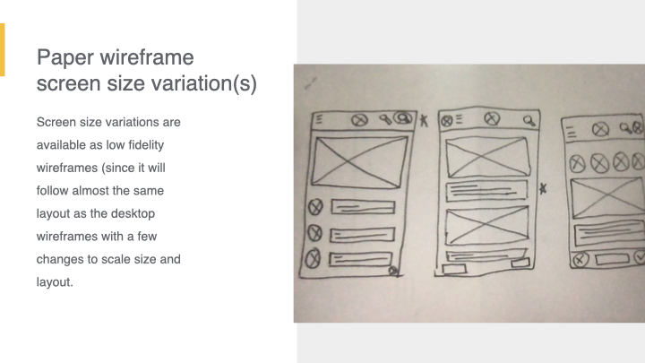
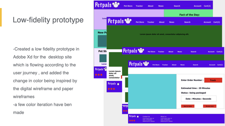
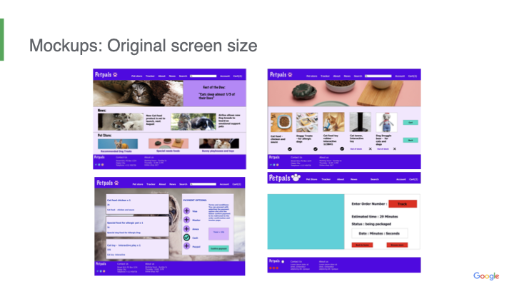
The amazing process of research, Ideations, and analysis followed by wireframes, mockups for various screen sizes based on user needs:
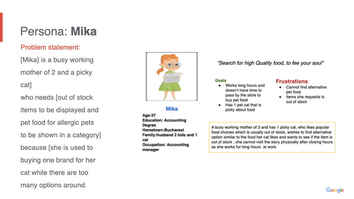
I made one on one interviews with multiple Users for this concert ticketing app, created Personas , identified the user needs and shared Ideas, I was also able to take notes and observe users proceed with the usability study in order to create a prototype then refine it, followed by letting the users test the prototype.
Our targeted users were pet owner, enthusiasts and friends and family members of any pet owners from all ages, backgrounds, shapes and sizes!
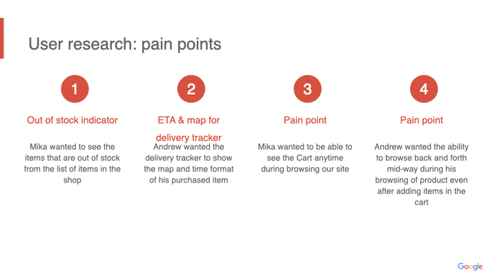
Each User should be able to browse Items, Add items in their shopping cart, new pet news (if required), and then check the cart, check out confirm payment then display the delivery tracker with the ETA format and GPS map display.
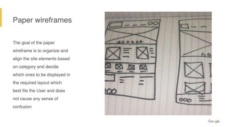
Wanted to align the main items on top of the page, and include a few previews of each category on the homepage, which also includes the number of items on the cart (in case users want to go check some pet news out and be able to navigate back to their cart with ease.
“while each area of the site should be organized based on related items, menus”
Something, every pet owner need, whether its on the go, to panned, your fluffy companions will sure have fun!
This was a very enjoyable journey and process from start to finish.
Next steps to take in the future:
What I learned during creating and designing this desktop design, that biases tend to hinder the creative process, while wireframes created can change based on any iteration or enhancement to the project and everyone is improving throughout the process.
Conduct more usability studies to check for more enhancements on prototype
Participate in a little more research and see what extra perks that can be added to engage with the users and making the experience even more fun.
Create more icons that fit the site theme for pets
For the full PDF file: PetPals case study

